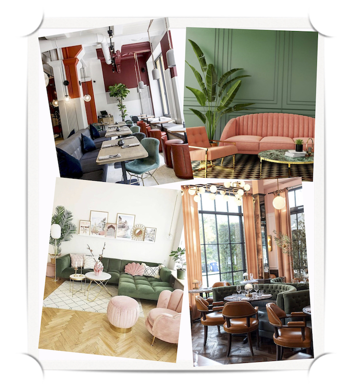

I was talking to a friend the other day who happens to be an interior designer and he confessed that selecting color palettes for residences and restaurants is an exhausting process. Colors and patterns play an important part in creating the ambience of a place and have the potential to make or break it.
Have you ever wondered why we end up going to the same place every time we go out? What makes us feel comfortable there? The soft lights, wooden furniture that radiates warmth, lux upholstery and delicious coffee all come together to create your perfect coffee shop. Here are some tips and resources to help you choose the right colors for your client’s café, bar, restaurant or bakery. Read on, my friend.

Not quite there, are we? Now, we will tweak the shades a bit so that all the colors go with each other and also look good together. Orange could a little muted, pink could be more warm, maybe salmon and teal could be a little less intense so that there is variation in the saturation of teal and burgundy. Rearrange the colors according to their intensity. Looks better, right! We have more clarity now in terms of color range and saturation.


You now have something to start with. You can edit this palette according to the practicality of the material available locally, your client’s taste and your expertise. For more information on how to order furniture using these color and material palettes drop me an email at nandita@kernigkrafts.com, I’d be happy to help!
Here are some frequently asked questions (FAQs) based on the article about selecting a color palette for a restaurant:

Colors and patterns set the mood of a space, influencing both the customer experience and the ambiance. The right palette can make a restaurant feel welcoming, stylish, or luxurious, which in turn attracts the right clientele and boosts business.
Start by asking your client for descriptive keywords that reflect the desired atmosphere. For example, words like “friendly,” “classy,” or “warm” can guide the selection of colors. Aim for at least 5-6 adjectives to define the space’s vibe.
Sure! For a warm and regal atmosphere, you might assign:
Friendly = Orange
Regal = Burgundy
Warm = Pink (or Salmon)
Classy = Teal
Stylish = Sage Green
Each color should reflect the emotional tone of the keyword.
No, while colors are crucial, consider how they work with patterns, materials, and textures. You’ll also want to incorporate metals and neutral tones, which help balance and complement the primary color palette.
Online tools like Coolors and Colormind are useful for generating color palettes. They offer easy-to-use interfaces and help create cohesive palettes based on your chosen color criteria.
Adding metals like gold or silver can elevate the space and enhance the regal or luxurious feel. Even if your client isn't keen on using metal extensively, it can always be used as an accent color.
Patterns should align with your client's desired vibe. For example, if the keywords suggest a classy and friendly atmosphere, opt for contemporary or geometric patterns instead of overly ornate designs. Patterns can be used on upholstery, walls, rugs, or even ceilings.
Yes, the palette should evolve as you refine the design. You may need to adjust shades, saturation, or even materials based on practicality, client preferences, or the available local materials.
Pinterest is a great platform for finding interior design inspiration. You can search for color palettes or specific themes that match your keywords. It’s also helpful to visit design-focused websites for ideas.
After assembling your palette, you can add neutral tones, test out the chosen materials locally, and consider the client's specific needs. You can also adjust based on your experience and the practicalities of the design.
[…] Trích nguồn: … […]
The diverse world of home decor and furniture offers endless options for every type of home. Apkainterior.com stands out as a top website, providing a wide range of furniture and home decor items at affordable prices. Visit Apkainterior.com to explore an extensive collection of high-quality products to enhance your living space.
It was a pleasure reading this blog. As you explained in your article, color plays a significant role in the design of interiors and restaurants. This is a must-read for anyone seeking to elevate their space with the right color palette.